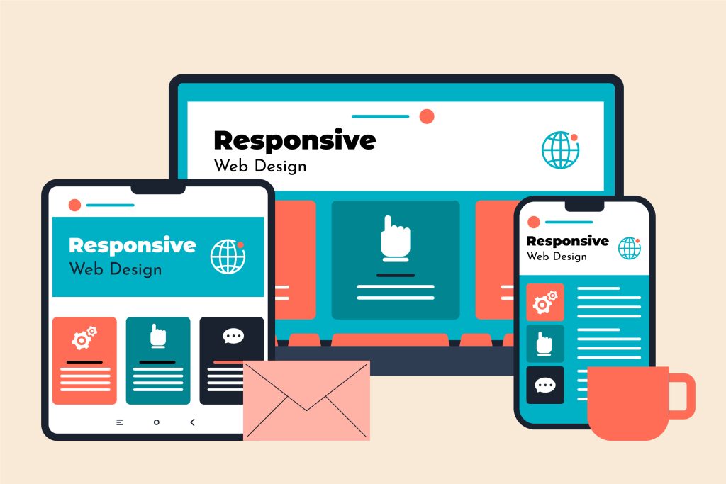
We create fully responsive websites that adapt seamlessly to all screen sizes including mobile, tablet, and desktop. Our designs ensure fast loading speed, better user experience, and improved SEO performance.
Our responsive web design approach focuses on delivering smooth navigation and consistent performance across all devices. We use modern technologies like HTML5, CSS3, JavaScript, and frameworks such as Bootstrap and React to build fast and scalable websites. By combining modern design principles with optimized code, we ensure your website looks great, functions perfectly, and engages users effectively.
We provide better
services for your business
Experience & Expertise
Our expertise ensures your website performs seamlessly across all devices, delivering a smooth and engaging user experience.
Customized Responsive Solutions
From layout to functionality, everything is optimized for mobile, tablet, and desktop users.
Trust and Reliability Gained
We take pride in being a trusted and reliable partner for our clients. You can count on us to deliver on our promises.
WORK PROCESS
How to Get Started
1
Project scoping
The process of defining the scope, goals, timeline, and resources required for a new IT project or service.
2
Planning and design
The process of designing the architecture, software, and hardware required to implement the project or service.
3
Development and testing
The process of coding, developing, and testing the software and hardware components required for the project or service.
4
Maintenance and support
The ongoing process of maintaining and updating the software and hardware components, providing technical support.
Select the fields to be shown. Others will be hidden. Drag and drop to rearrange the order.